CRM Rebranding - SmashFlyX
OVERVIEW
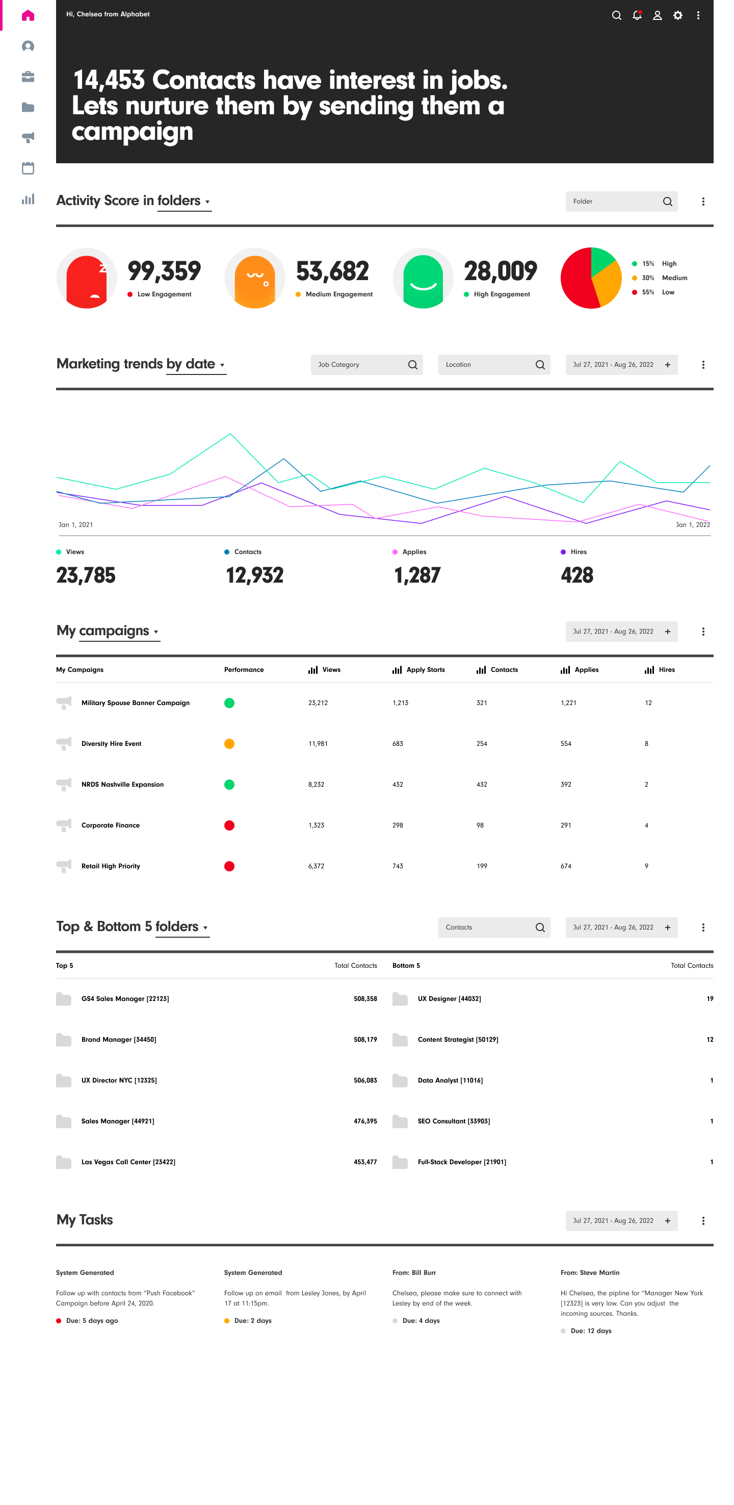
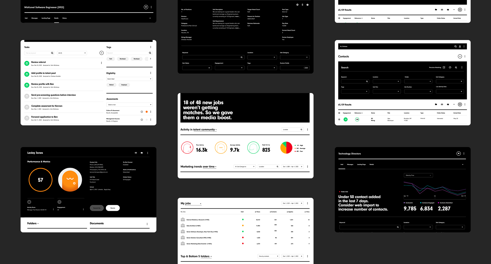
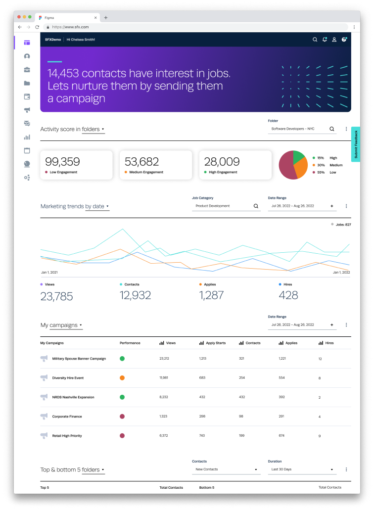
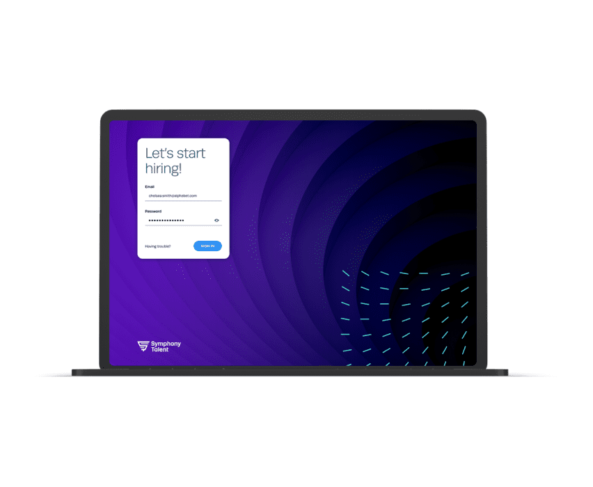
This project focused on rebranding and enhancing the UI/UX of SmashFlyX (SFX), Symphony Talent’s recruitment CRM tailored for talent acquisition teams. The objective was to modernize the platform’s design, streamline workflows, and align its appearance with the professionalism expected by our clients. Key updates included retiring the playful “Phaser” characters and transitioning from a bright, vibrant color palette to a more refined and sophisticated one, ensuring the platform better reflects the needs and standards of our audience.
Branding
Product Design
Visual Systems
Role: Sr. UI/UX Designer
Company: Symphony Talent
THE CHALLENGE
The previous CRM faced several issues:
Outdated Visual Design: The playful illustrations and bright colors undermined the platform’s credibility with professional HR teams.
Complex Workflows: Frustrating navigation and inconsistent UI elements created unnecessary friction for users.
Accessibility Issues: Users found the font difficult to read. It was either too bold or too small. Users commented that the small white copy was hard to read on black backgrounds.
Issues with Navigation: Lack of breadcrumbs and the “Back” button didn’t always work.
OBJECTIVE
For over a year, Symphony Talent had received a number of negative comments from several of their key clients on the overall look and experience of SmashFlyX (CRM). This prompted the organization to undergo a complete company-wide makeover. This included a brand new logo, color palette, mission statement, and style guide.
The main objective for this project was to update the CRM and make it comply with the new style guide. I first gathered all the negative client comments and product change requests (PCRs) together and synthesized the changes. Then, I worked closely with product and engineering to prioritize the changes.
PROCESS
1. Research & Discovery
Analyzed user feedback and metrics to prioritize improvements.
Audited the current UI to document inconsistencies and usability issues.
2. Rebranding the Visual Design
Removed the playful “Phaser” illustrations.
Replaced the font with a more professional-looking one.
Transitioned from bright, youthful colors to a more mature, muted color palette to enhance credibility.
Collaborated with the marketing team to align the CRM’s visuals with the company’s overall branding.
3. Built a New Design System
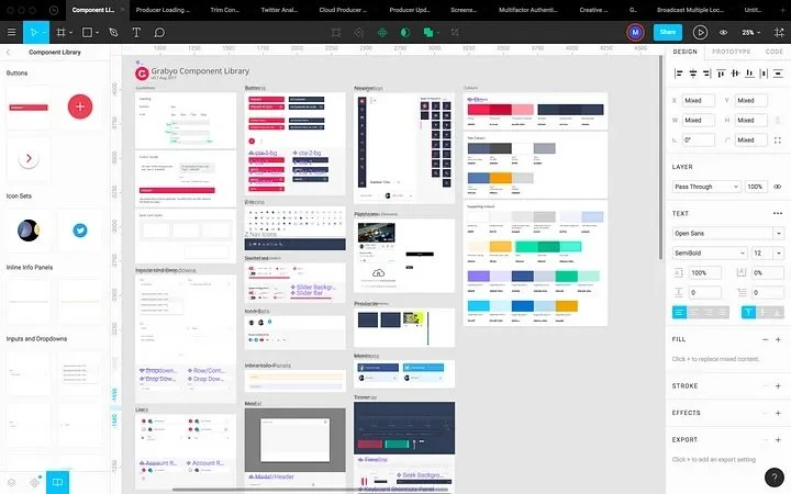
Developed a new Figma-based design system, including new icons, components, typography, and color guidelines.
Ensured the system supported scalability for future feature updates.
4. Prototyping & Testing
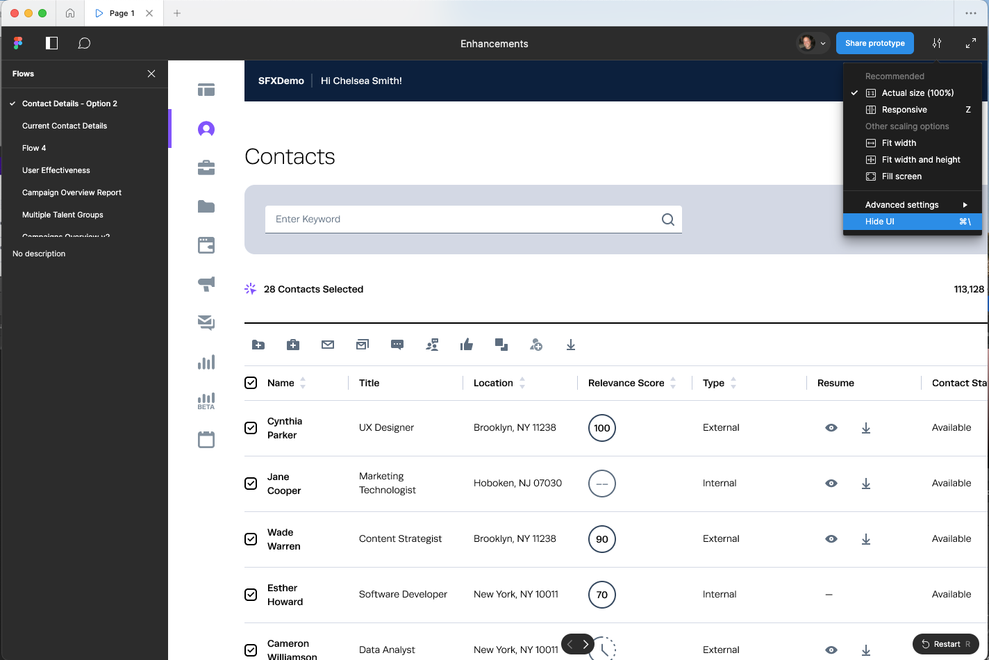
Created interactive prototypes for redesigned features.
Conducted usability testing sessions with end-users to gather feedback.
Iterated on designs based on testing insights to resolve usability issues.
5. Collaboration & Handoff
Worked closely with developers, providing annotated Figma files and holding regular design reviews.
Maintained open communication with stakeholders to ensure alignment throughout the project.
THE SOLUTION
The rebranded CRM featured a polished, professional design that resonated with our clients. The removal of the “Phaser” illustrations and the adoption of a more sophisticated color palette contributed to the platform’s credibility and promoted a level of trust among our clients. The introduction of a new font, simplified workflows, and the use of consistent UI components, all played a role in enhancing usability and user satisfaction.
OUTCOME & IMPACT
26% increase in user satisfaction, based on post-launch surveys.
Stronger brand perception, with users praising the professional and mature design.
Enhanced user engagement, leading to increased adoption across organizations.


