
Media Campaigns - SmashFlyX
OVERVIEW
Symphony Talent’s Media Campaigns feature, powered by AdTech, enables clients to manage and track recruitment marketing campaigns. However, clients consistently expressed that the existing tool was overwhelming and difficult to use. Complaints ranged from information overload to a confusing Budget tab that left clients unsure of how their budgets were allocated or performing. The redesign aimed to simplify the user experience, modernize the layout, and make campaign management intuitive and actionable.
AdTech
Role: Sr. UI/UX Designer
Company: Symphony Talent
THE CHALLENGE
Key pain points identified:
Information Overload: The existing interface displayed excessive details, making it hard to focus on what mattered.
Outdated Layout: The design felt cluttered and visually unappealing, reducing user engagement.
Budget Confusion: The Budget tab was unclear, leaving users frustrated and unsure about budget tracking and spending oversight.
Low Accountability: Clients felt that their budgets weren’t being actively monitored due to the tool’s complexity.

KEY OBJECTIVE
To simplify and enhance the effectiveness of Media Campaigns on SmashFlyX by optimizing campaign management tools, improving analytics and insights, and enabling better targeting, ultimately driving higher engagement and ROI for users.
PROCESS
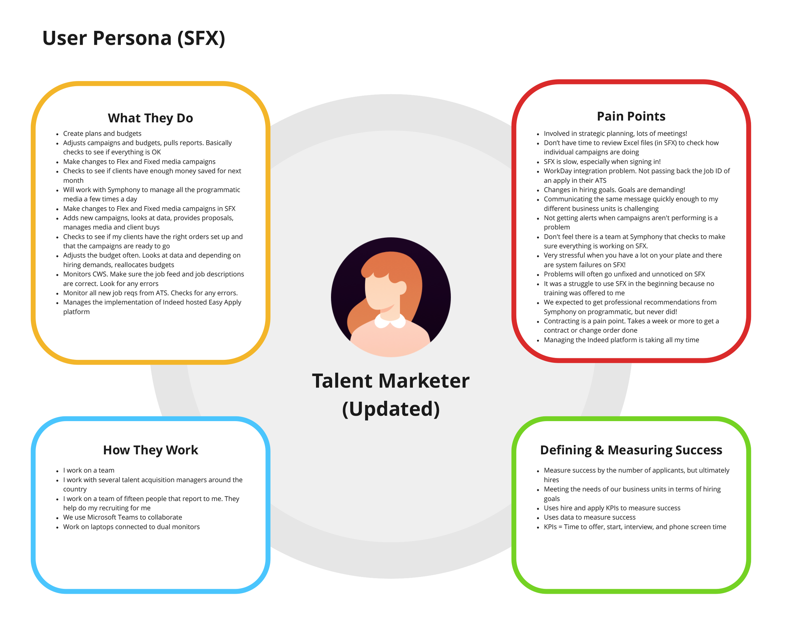
1. Research & Discovery
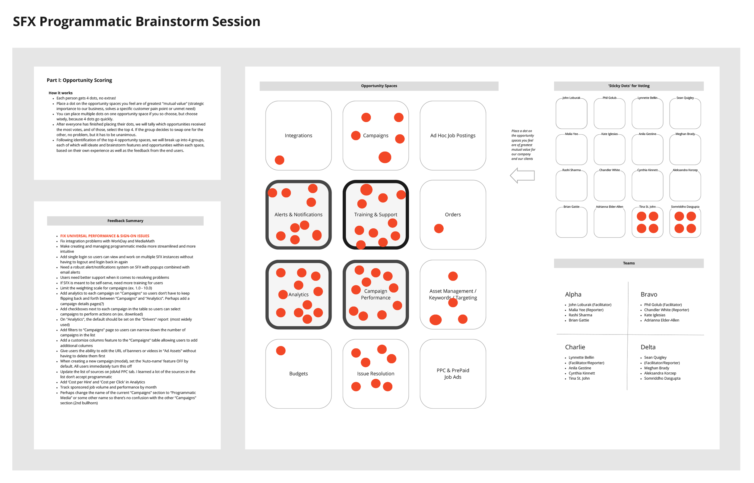
Conducted user interviews and several brainstorming exercises with clients to understand their struggles and goals.
Analyzed feedback to identify trends, particularly around information overload and budget tracking.
Reviewed competitor tools to explore how other platforms streamlined campaign management.
2. Redesigning the Media Campaigns Interface
Decluttering Information: Grouped data into clear, digestible sections, prioritizing the most relevant metrics.
Modernized Layout: Introduced a clean, responsive design that balanced white space and highlighted key actions.
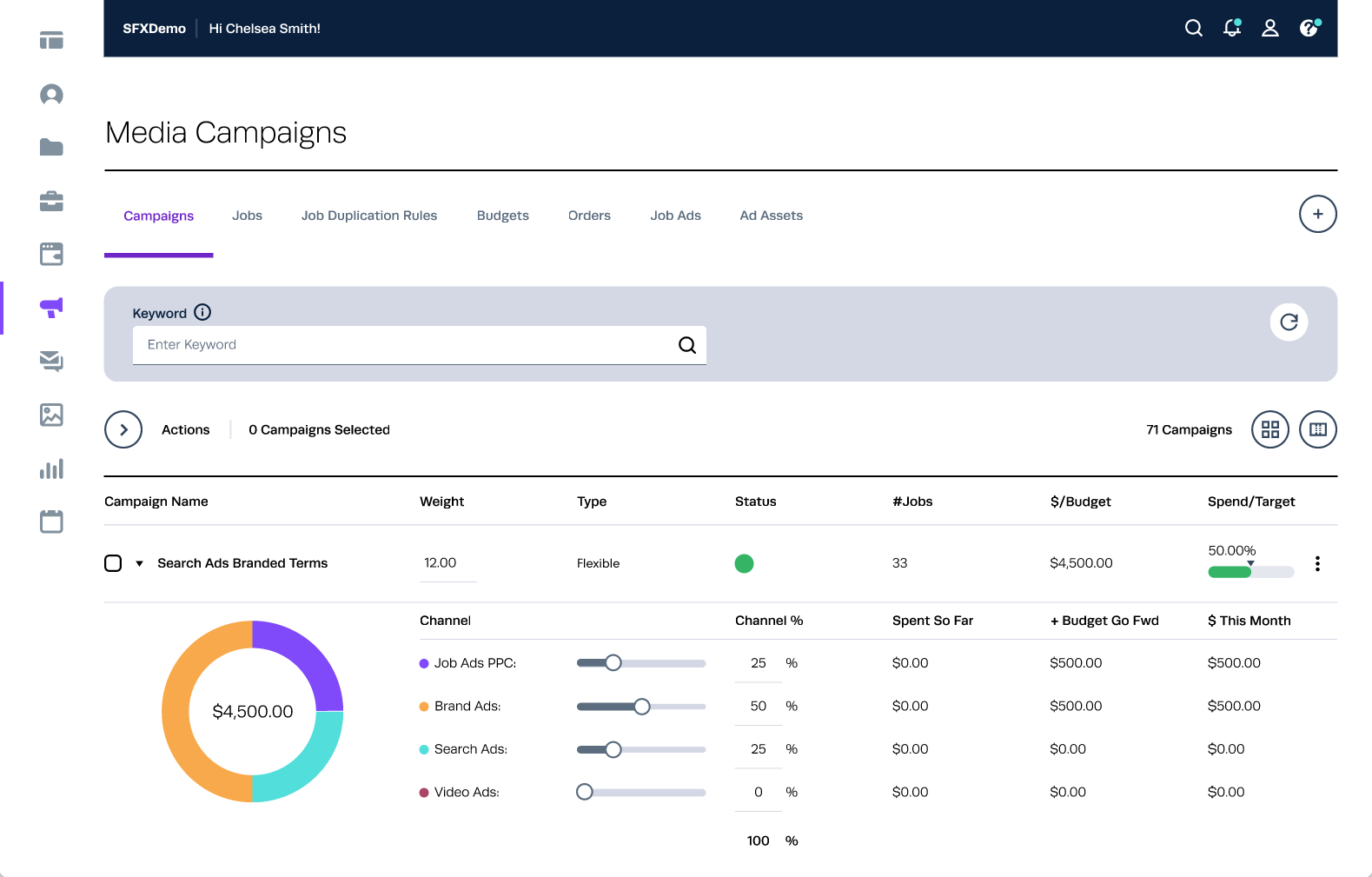
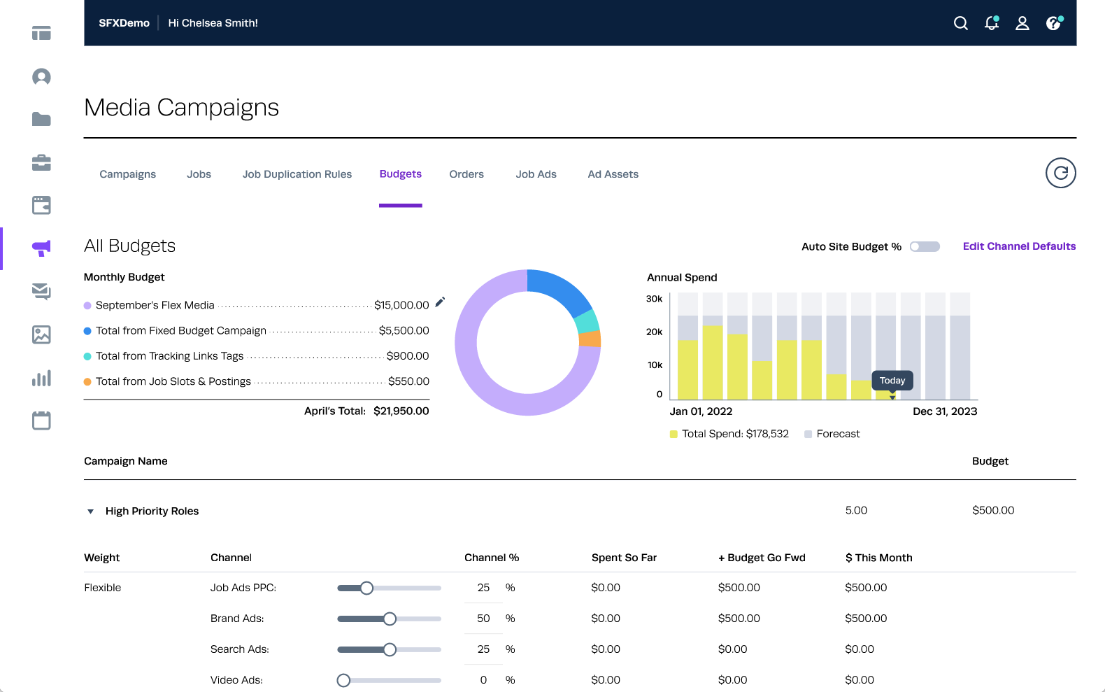
Revamped Budget Tab: Simplified budget tracking with clear visualizations, such as progress bars and spending breakdowns, to give users a quick snapshot of their financial performance.
Added Alerts & Notifications: Built-in notifications to flag budget overspending or underutilization, addressing concerns about accountability.
3. Prototyping & Testing
Designed prototypes in Figma showcasing the new layout and Budget tab features.
Conducted usability testing sessions with existing clients to gather feedback and refine the design.
Iterated on the design based on client input to ensure clarity and usability.
4. Development Collaboration
Partnered closely with the development team to implement interactive elements like visualizations and alerts.
Provided detailed design specifications and attended regular check-ins to ensure alignment.


THE SOLUTION
The redesigned Media Campaigns included:
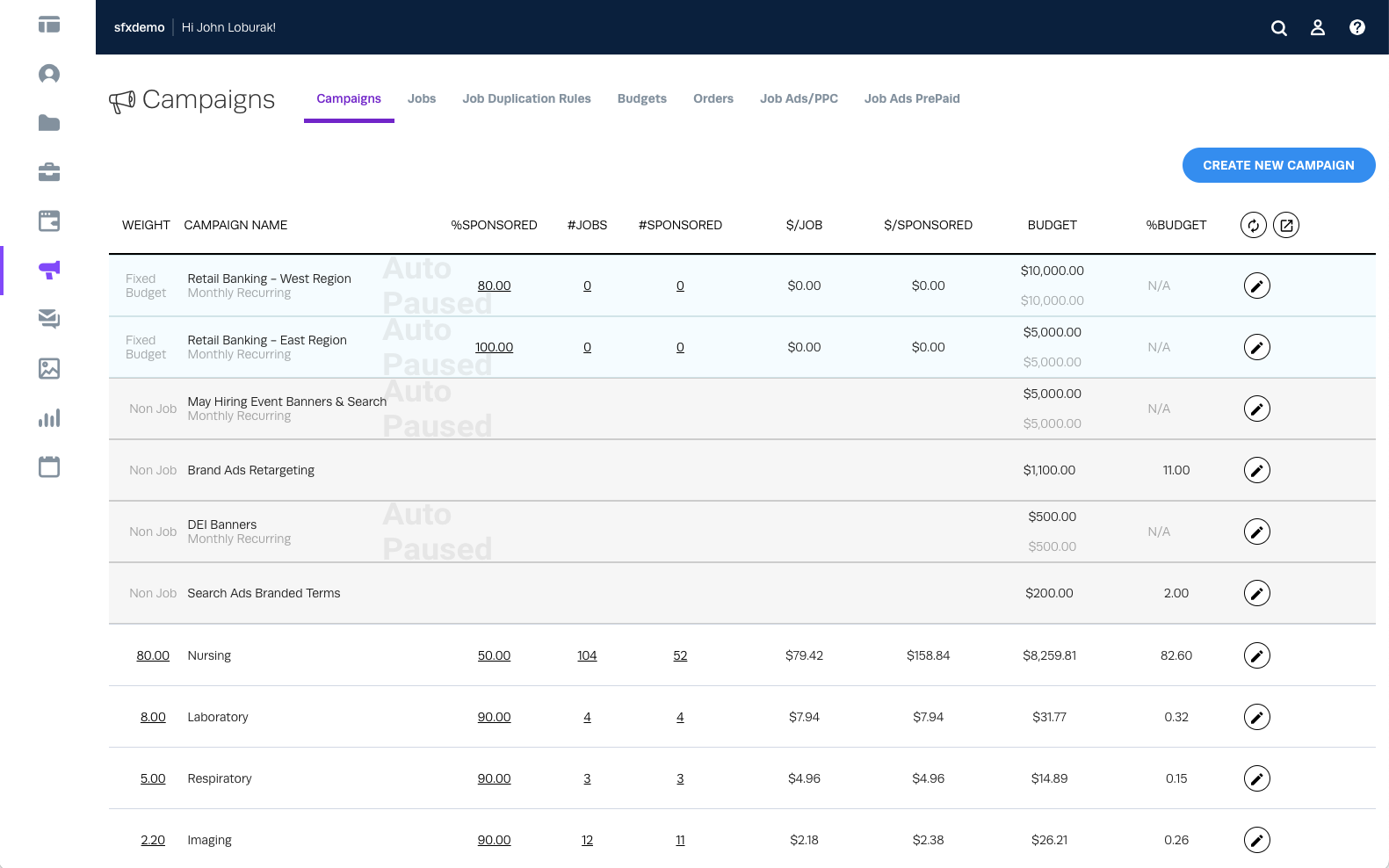
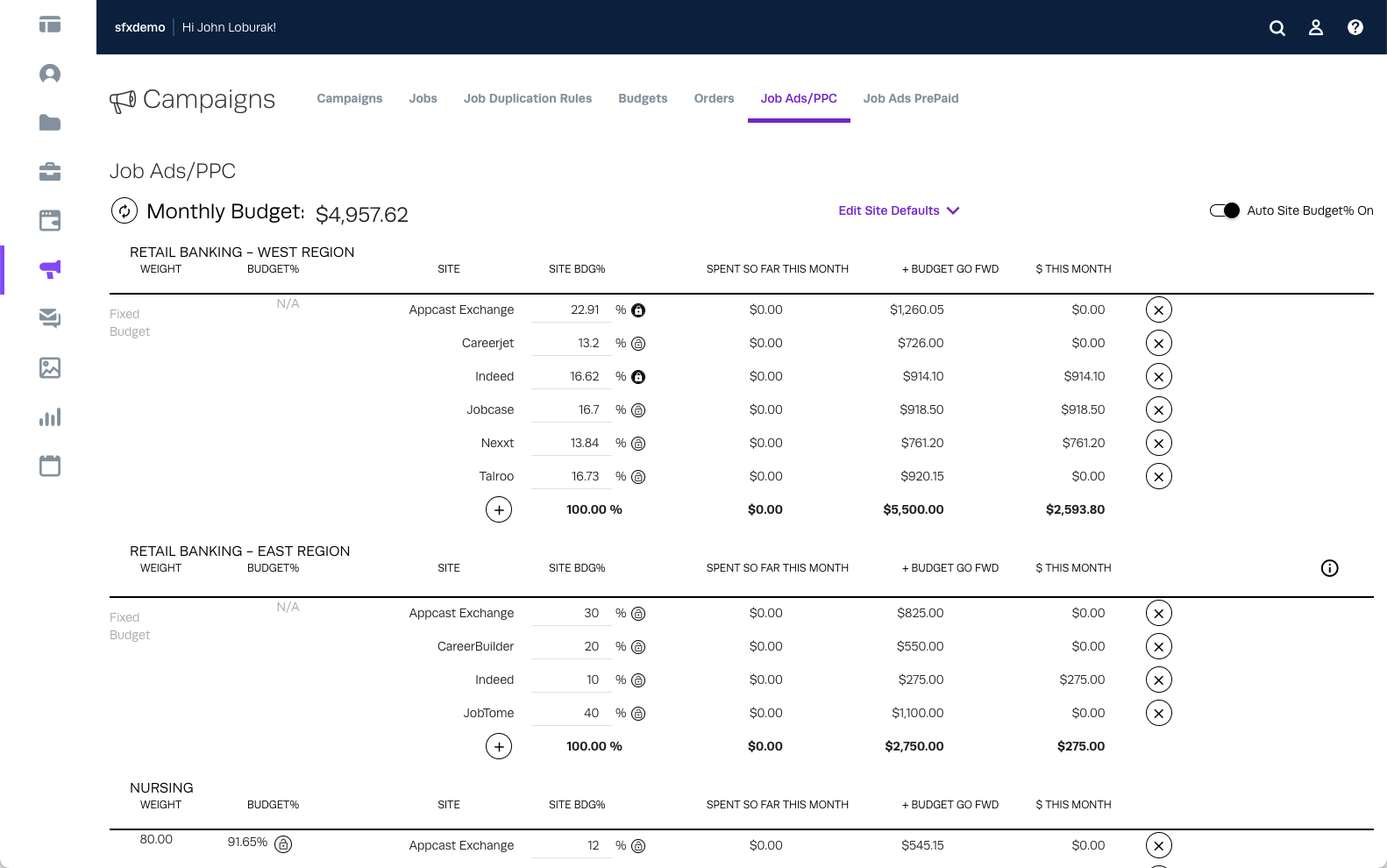
Simplified Interface: A clean, intuitive layout that prioritized essential information while reducing clutter.
Improved Budget Tracking: The Budget tab featured visual progress bars, pie charts, and clear summaries of spending versus budget allocation.
Focus on Accountability: Alerts and notifications ensured users were aware of their campaign’s financial status at all times.
Enhanced Usability: Streamlined workflows made it easier to navigate and manage campaigns without feeling overwhelmed.
OUTCOME & IMPACT
Reduced Complexity: Clients found the new interface significantly easier to navigate and understand.
Increased Budget Awareness: Clear visualizations and alerts gave users greater confidence in tracking and managing their budgets.
Higher Engagement: The modernized design encouraged clients to spend more time using the tool, improving campaign performance.
Positive Feedback: Clients noted that the redesign made Media Campaigns “feel like a modern, user-friendly tool.”